
Back in May I wrote about a fabulous, strange old book about two warring nations, one fat and one thin, who live far beneath the surface of our own world. Originally published in the inter-war years, Fattypuffs and Thinifers simultaneously offers comment on the Great War and a warning of the war that was yet to come. It is also remarkably fresh and very funny.

So I was delighted that Vintage Children's Classics, who have been producing some stunning reprints over the last year were producing a new edition. The cover of this spanking new version is by the super talented Kristyna Lytten (Chickens Can't See in the Dark). I asked her some questions, and she answered them.
Had you read Fattypuffs and Thinifers before you were asked to work on the new edition? What did you make of it?
No, sadly not. But once I was given the project I received a few chapters to read. Which is what usually what happens. Those chapters usually reflect what the editor or designer wants to capture a sense of on the cover illustrations. There has only been a few occasions where I been given a full previous edition, and I always read as much as I can. However what I read was fab, and the way Maurois writes about the characters is so visually inspiring it wasn't difficult to capture a sense of that in my illustrations.
Were you aware of the versions by Jean Bruller and Fritz Wegner? If so what did you make of their distinctive takes on this world?
I think they are great. In fact the illustrations by Wegner are in the new version. I would have loved to have been asked to illustrate the interior illos to. But Wegner's illustrations and F&T really do come hand in hand, it would almost be a shame to discard them. And I think children and adults alike will find them very humourous. I know I did.
What did you want to bring to the book?
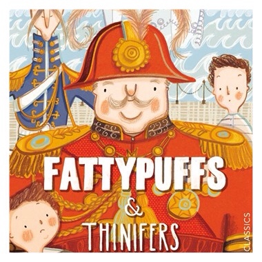
I think my main concern was to complement the feel of the book. I wanted to inject my style into the characters, but also given that Wegner's illustrations are inside the book, not stray too far from them either. So that the characters are relatable with what the reader sees inside. I think the book is really character orientated too. I love that, and so really wanted them to to be a real focus on my design. I hope I did that, and I think our Fattypuff ( King Plumpapuff) particularly makes a real impact with his royal red uniform, decorated with tassels and medals.
What opportunities do the two contrasting nations offer the illustrator?
Its a real play on opposites. flamboyant and sleek, bubbly round shapes and sharp, pointy shapes. Fat, thin, short and tall. You can really go wild with the design of everything that features in the contrasting worlds. from the more obvious houses and furniture to glasses and food. You can see how Wegner has done this and pushed it to the extreme. I had great fun exploring this in my research sketches.

Are there any scenes that you think are particularly memorable?
I'm not sure if there is one particular scene. There are some great bits in the book that really warrant some fab double spread b&w illustrations. But, being a bit of a foodie I would have loved to illustrate anytime where the fattypuffs are eating their very generous meals. And I'd love to know what a 'Lobster Fattyborough' is. Sounds delish. Infact the new version of the book there is a fattypuff recipe on how to make cream buns!!

Are there any other classics that you'd like to illustrate?
I've recently done a number of classics covers for audiobooks. Alice in wonderland, Oliver, Jungle book, The Secret Garden Etc But I would love to revisit a few of them as I have a few ideas up more sleeve that I think would make lovely book covers.
Thanks Kristyna


One thought on “Fattypuffs & Thinifers – Kristyna Lytten Q&A”